One master banner in. Seventeen formats out. Nothing retouched.
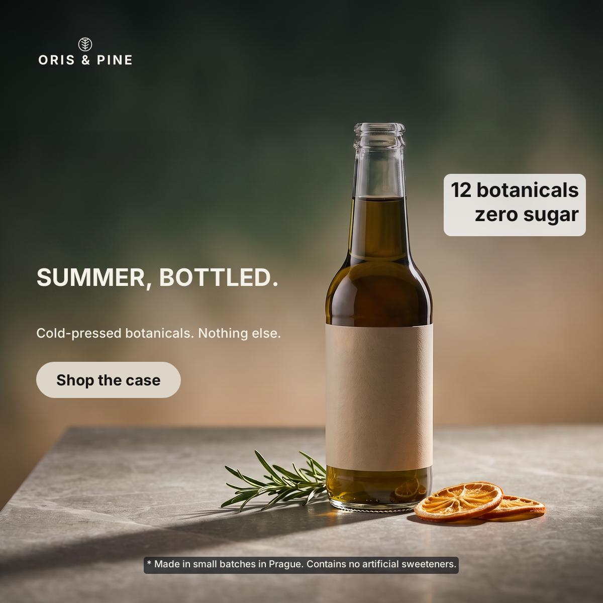
Oris & Pine is our demo brand — we invented it, logo and all, so we could show real output without a client's permission. Every image below is unretouched pipeline output from one run, 20260906-164004_resize_oris-pine, and every number on this page is read from that run's own records.
What went in
One 1200×1200 master banner and the brand's SVG logo. Step 1 read the copy off the banner — headline SUMMER, BOTTLED.
, support line Cold-pressed botanicals. Nothing else.
, the button label Shop the case
, plus the 2 secondary elements it carries (12 botanicals zero sugar, * Made in small batches in Prague. Conta) — and we approved it as the brief. That brief, not the source image, is what every format is judged against.
Step one: the background, recovered
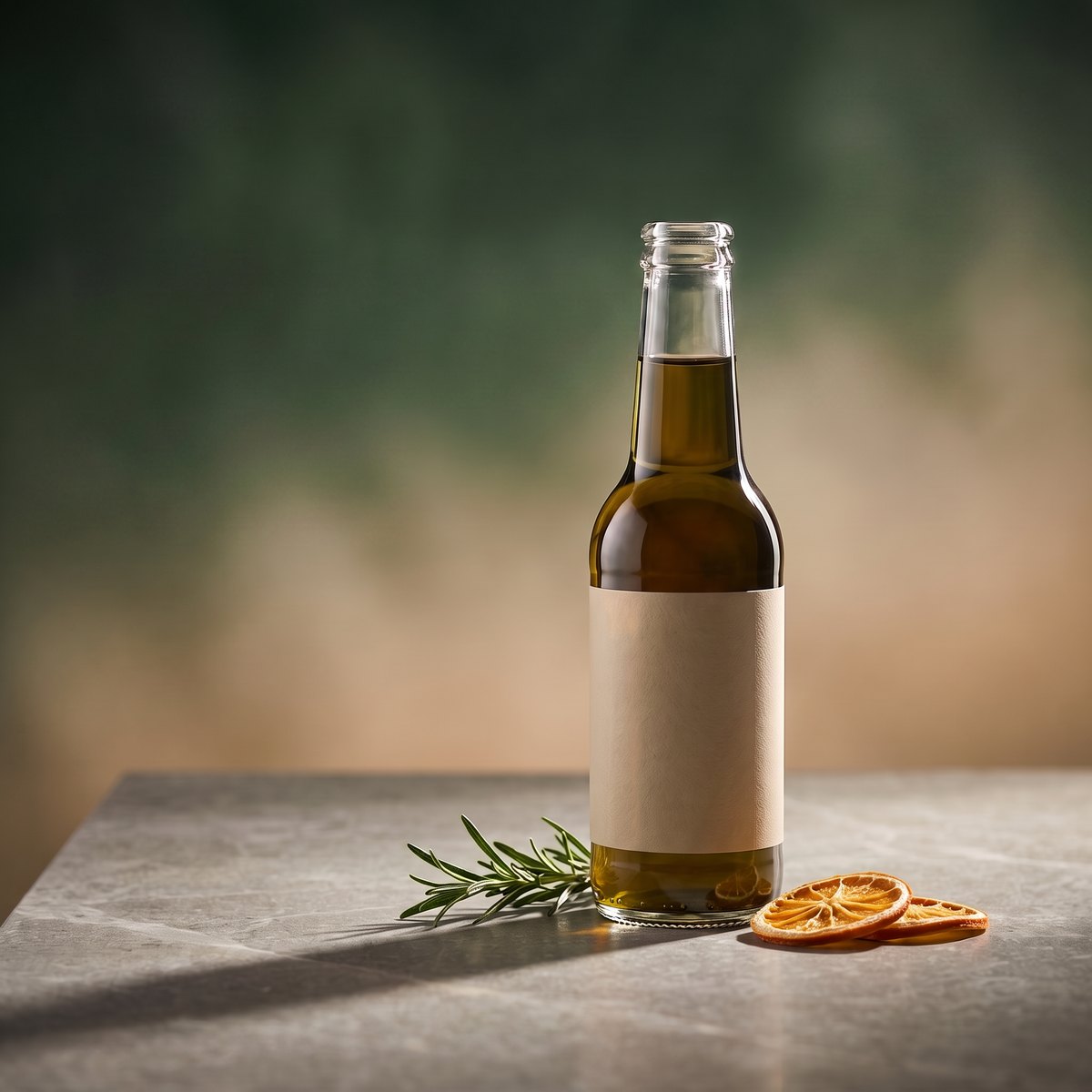
The graphic layer — headline, button, callout, legal line, the corner logo — is removed and the photograph behind it reconstructed. The bottle's own label is part of the product, so it stays. This background is generated once and then extended to each aspect ratio; sixteen more formats share it.
Step two: re-set as real layers
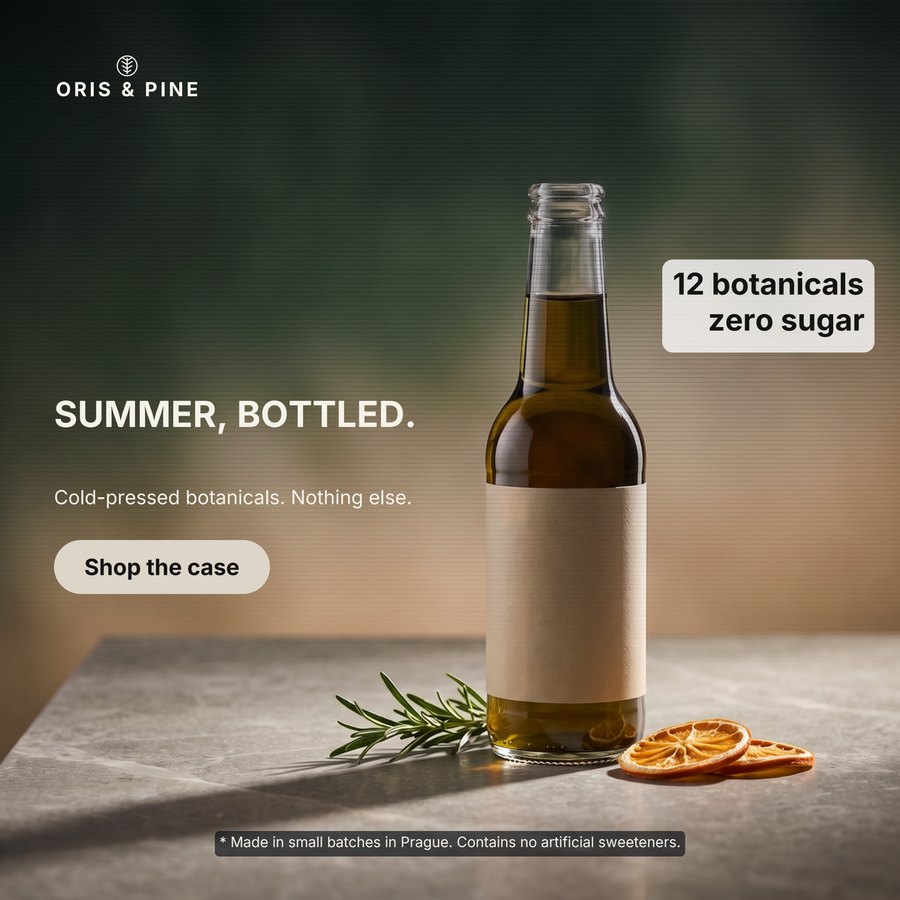
For each format the AI decides where the logo, headline, support line, button and campaign elements go on that canvas, and the renderer draws them as separate layers — so the SVG opens in Figma with the text still text, and the PDF drops into Canva.
All 17 formats
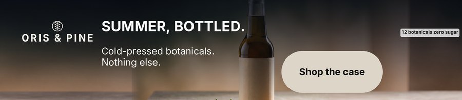
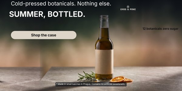
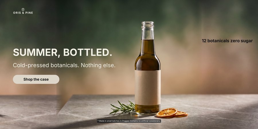
Every export from the run, in catalogue order, with the art director's score on each.
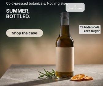
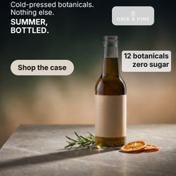
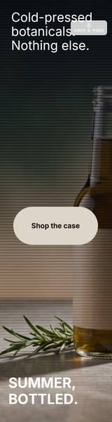
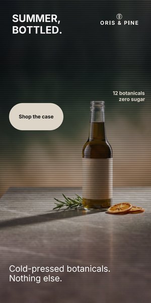


Step three: the check — this is the part to trust
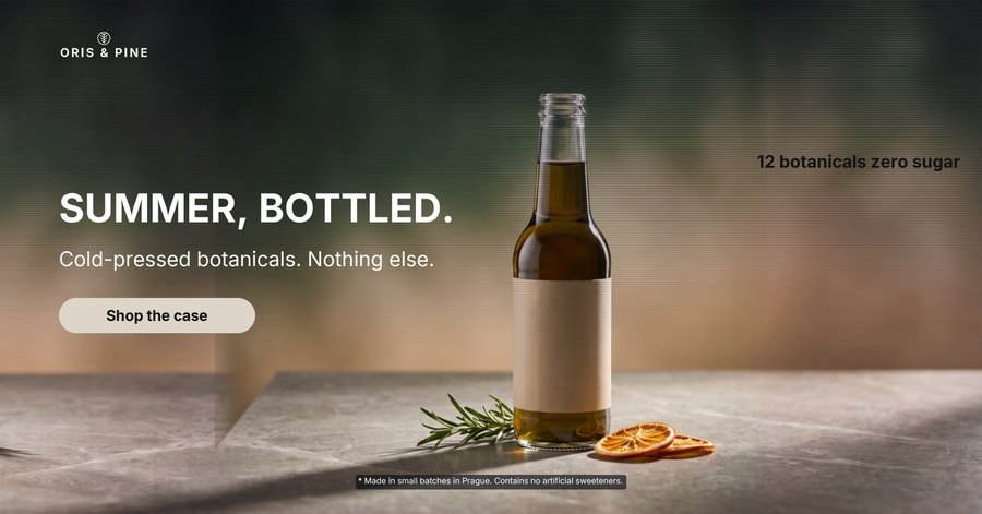
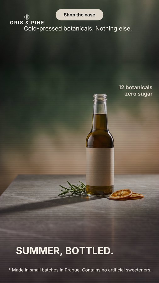
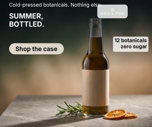
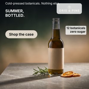
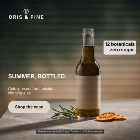
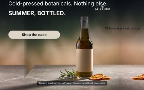
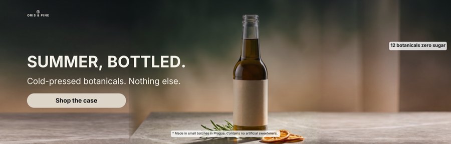
An AI art director (claude-sonnet-5) scores every composed format against the approved brief. A format that fails its first layout is re-laid-out once with the critic's notes and the better version wins. In this run 5 formats were flagged on their first layout and re-laid-out automatically; 1 came out passing, and 4 still did not reach a pass — they are shown below exactly as the art director left them, not hidden. Generation varies; the check exists because it does, and a flagged format is the check doing its job.
| Format | Score | Verdict | Re-laid-out | The art director's note |
|---|---|---|---|---|
| 1200×628 | 85 | passed | — | The legal line sits inside a small dark rectangular box that looks like an unfinished overlay patch rather than an intentional design element, slightly clashing with the rest of the composition. |
| 1200×1200 | 92 | passed | — | no issues raised |
| 1080×1920 | 72 | passed | — | Top area is cluttered with logo, CTA button, and secondary tagline crammed close together with little separation, giving an unfinished layout feel. |
| 300×250 | 75 | passed | — | The secondary claim line at the very top is tightly cropped near the canvas edge, giving a slightly cramped feel. |
| 336×280 | 58 | needs review | yes | The secondary line 'Cold-pressed botanicals. Nothing else.' is clipped at the very top of the canvas, cutting off part of the text. |
| 250×250 | 52 | needs review | yes | Top area is extremely cluttered: secondary line, headline, logo, and badge are all crammed into a small strip and appear to overlap each other, reducing legibility. |
| 160×600 | 85 | passed | yes | Small logo/badge element near top overlaps bottle neck slightly, creating minor visual clutter, but does not obscure required copy. |
| 300×600 | 88 | passed | — | Badge text sits over a mid-toned background area with slightly reduced contrast, but remains legible. |
| 728×90 | 88 | passed | — | Bottle image is tightly cropped at the bottom edge and headline text slightly overlaps the bottle neck, but legibility is maintained. |
| 640×100 | 90 | passed | — | no issues raised |
| 300×300 | 58 | needs review | yes | Secondary claim line 'Cold-pressed botanicals. Nothing else.' is positioned at the very top edge of the canvas and appears clipped/cut off. |
| 480×480 | 88 | passed | — | Badge and legal line have plain rectangular backgrounds that look slightly unfinished compared to the source's stylized circle/plain text, but remain legible. |
| 480×300 | 52 | needs review | yes | The secondary claim 'Cold-pressed botanicals. Nothing else.' appears above the main headline 'SUMMER, BOTTLED.', reversing the required order of the two distinct lines. |
| 970×310 | 88 | passed | — | Legal line text sits partially over the orange slices, slightly reducing contrast/legibility. |
| 970×210 | 85 | passed | — | Bottle neck/top is cropped at the top edge of the canvas, appearing cut off. |
| 600×300 | 78 | passed | — | Badge text '12 botanicals zero sugar' is small and low-contrast against the blurred background, reducing legibility. |
| 1200×600 | 82 | passed | — | A faint vertical seam/line artifact is visible in the background near the left third, suggesting an image extension seam. |
Everything here traces to one directory on our server: the exports, the verdicts, the timing. If we ran it again the scores would differ a little — that is what the check is for.